When it comes to refreshing your home's interior, few design decisions have as much impact as choosing the right paint color. Whether you're updating a single room or undertaking a complete home renovation, staying informed about current paint color trends can help you create a space that feels both contemporary and timeless. Here in Kansas City, MO, homeowners are embracing a diverse palette of colors that range from soothing earth tones to dramatic jewel hues, and we're here to guide you through the most sought-after interior paint colors for this year.
At KC Painting, we've worked with hundreds of Kansas City homeowners to transform their spaces with the latest color trends. Our experience has shown us that the most successful interior paint projects combine current design trends with personal preference and the unique characteristics of your home's lighting and architecture. In this comprehensive guide, we'll explore the trending paint colors that are dominating Kansas City homes and provide practical advice on how to incorporate them into your own space.
The Rise of Nature-Inspired Neutrals
One of the most significant shifts in interior paint trends is the move away from sterile, cool grays toward warmer, more natural neutral tones. Kansas City homeowners are increasingly recognizing that not all neutrals are created equal, and the new generation of neutral colors offers far more sophistication and personality than the stark whites and cool grays of previous years.
Warm Greige: The New Go-To Neutral
Greige—a beautiful blend of gray and beige—has become the neutral of choice for homeowners seeking sophistication without coldness. This color category includes options like Mega Greige (SW 7031) and other warm organic colors that avoid appearing overly gray or orange. These versatile hues work beautifully as a backdrop for virtually any design style, from modern minimalist to traditional and farmhouse aesthetics.
Warm greige is particularly popular in Kansas City because it complements the region's natural light patterns throughout the seasons. The warm undertones prevent rooms from feeling cold during winter months while remaining fresh and inviting during summer.
Hidden Gem and Other Designer Favorites
Behr's 2026 Color of the Year, "Hidden Gem," represents a shift toward colors with more depth and character. This sophisticated neutral offers homeowners a way to move beyond basic wall colors while maintaining the versatility needed for a whole-home palette. Similarly, designer-approved creamy whites and soft, buttery tones are making a comeback as homeowners seek to create inviting, warm spaces rather than stark, clinical environments.
These neutrals typically range from $30-$60 per gallon for quality interior paint, making them a cost-effective way to dramatically change your home's atmosphere.
The Jewel Tone Revolution
Perhaps one of the most exciting trends in Kansas City interior design is the embrace of rich jewel tones. These deep, saturated colors bring luxury and sophistication to any space, and they're far more versatile than many homeowners realize.
Deep Blues and Navy
Navy blue remains one of the most popular interior paint colors, and for good reason. Deep navy, forest greens, and smoky teals work exceptionally well in dining rooms, home offices, and bedrooms. These colors create a sense of drama and sophistication without feeling overwhelming when applied thoughtfully.
In Kansas City homes, deep blues work particularly well in spaces with ample natural light, as they prevent rooms from feeling too dark or cave-like. Navy is also incredibly forgiving when it comes to showing wear, making it an excellent choice for high-traffic areas and family spaces.
Emerald Green and Rich Jewel Tones
Emerald green and other rich jewel tones represent the pinnacle of sophisticated interior design. These colors create dramatic, memorable spaces that instantly elevate a room's aesthetic. Whether used on all walls or as an accent wall, jewel tones make a powerful design statement.
The key to successfully using jewel tones is proper lighting and preparation. Quality primer is essential, and you may need two coats for optimal color saturation. KC Painting recommends consulting with our team before committing to jewel tones, as we can help you assess your space's lighting conditions and choose complementary accent colors.
Deep Reds and Aubergine
Charcoal, aubergine, and deep oxblood reds are making a comeback in feature walls, particularly in dining areas and home offices. These rich shades convey luxury and create intimate, refined spaces. While bold, these colors are surprisingly balanced and sophisticated when executed with quality paint and professional application.
Calming Colors for Wellness-Focused Spaces
The wellness trend continues to influence interior design, with homeowners prioritizing colors that promote relaxation and mental well-being. This shift reflects a broader understanding that our home environments significantly impact our stress levels and daily mood.
Earthy Greens: The New Neutral
Earthy greens have emerged as the new technically-neutral color category. Sage, muted olive tones, and colors like "Evergreen Fog" and "Edge Olive" work beautifully with natural materials and create a sense of calm that gray and beige simply cannot achieve. These greens are particularly popular in Kansas City, where they complement the region's natural landscape and seasonal changes.
Warm eucalyptus, another trending green from Valspar's 2026 palette, bridges the gap between cool and warm undertones, making it compatible with virtually any existing décor or finishes in your home.
Tranquil Blues and Muted Teals
Beyond the dramatic deep blues, softer teals and muted blue tones offer a more restful aesthetic. These colors work particularly well in bedrooms, bathrooms, and meditation spaces. Traditional turquoise, while cyclical in popularity, continues to appear in trend forecasts and never fully falls out of favor among sophisticated designers.
Muted Pastels and Soft Hues
Muted pastels are bringing a soft and soothing touch to Kansas City interiors. Dusty rose, pale lavender, and muted mint green offer understated elegance without the starkness of pure white or the coldness of clinical grays. These colors are especially popular in bedrooms, nurseries, and powder rooms where a gentle, inviting atmosphere is desired.
Warm Earthy Tones Making a Comeback
As part of the broader shift toward nature-inspired palettes, warm earthy tones are experiencing a significant renaissance in interior design.
Terracotta and Clay Tones
Warm terracotta and clay tones bring Mediterranean warmth to Kansas City homes. These colors create a cozy, inviting atmosphere and work beautifully with natural wood finishes and earthy décor. Warm mahogany from Glidden's 2026 reveal offers a rich, grounded aesthetic that feels both contemporary and timeless.
Golden Yellows and Honey Tones
Golden yellows, like honey and marigold, are bringing warmth and energy to interiors throughout Kansas City. These shades are perfect for creating cheerful spaces that feel lively and optimistic. Unlike harsh, bright yellows of the past, these muted golden tones offer sophistication while maintaining their mood-boosting properties.
Honey and marigold tones work particularly well in kitchens, dining areas, and gathering spaces where you want to encourage conversation and positive energy. These colors pair beautifully with warm wood tones and natural finishes.
Bold Statement Colors and Accent Walls
While neutral palettes dominate many Kansas City homes, the trend toward bold statement colors is far from over. The difference is in execution—rather than painting entire rooms in dramatic colors, homeowners are strategically using bold hues to create focal points and visual interest.
Feature Walls and Accent Strategies
Feature walls remain a popular way to incorporate bold colors without overwhelming a space. Dark tones of blue, green, teal, and plum work especially well when applied to a single wall—typically the wall your eye naturally lands on when entering the room. This approach allows you to experience the psychological and aesthetic benefits of bold colors while maintaining balance throughout your space.
Home offices and dining areas have become the preferred spaces for bold accent walls, as these rooms benefit from the sophisticated, focused atmosphere that darker colors provide.
Divine Damson and Purple Tones
From jewel-toned purples like Divine Damson to more muted lavender options, purple tones are gaining traction in Kansas City homes. These colors offer a unique middle ground between the cool tones of blue and the warmth of red, making them surprisingly versatile despite their boldness.
Trending Paint Color Palettes for Different Rooms
Different rooms serve different purposes, and the most successful interior paint projects consider these functional and emotional needs when selecting colors.
Kitchen and Dining Room Colors
Kitchens are increasingly embracing warmer neutrals and subtle jewel tones. Soft creams, warm beiges, and muted sage greens create inviting culinary spaces without competing with cabinetry and countertops. For dining rooms, deeper colors like navy, emerald green, and even black create sophisticated spaces that enhance the dining experience and encourage lingering conversations.
Bedroom and Bathroom Sanctuary Colors
Bedrooms benefit tremendously from calming, wellness-focused colors. Soft blues, pale lavenders, muted greens, and warm taupes promote relaxation and better sleep. Bathrooms can handle slightly bolder tones since they're typically smaller spaces with shorter dwell times. Soft teals, pale blues, and muted pastels work beautifully here.
Living Room and Family Space Palettes
Living rooms and family spaces should balance comfort with style. Warm neutrals like greige and accessible beige (SW 7036) provide an excellent backdrop for living spaces, while accent walls in deeper jewel tones or moody colors add personality. These spaces benefit from color schemes that feel both sophisticated and livable.
Home Office and Professional Spaces
Home offices have become increasingly important, and color selection here can significantly impact productivity and mood. Deep blues, forest greens, and warmer neutrals work well, as they promote focus without the sterility of harsh whites or cool grays.
How to Choose the Right Trending Paint Color for Your Home
With so many beautiful options available, selecting the right paint color can feel overwhelming. KC Painting has helped thousands of Kansas City residents navigate this decision with these practical guidelines.
Consider Your Natural Light
Kansas City's lighting conditions vary significantly throughout the year. Southern and western-facing rooms receive abundant warm light, while north-facing spaces tend toward cooler, more diffused illumination. Before selecting a color, observe how light moves through your room at different times of day and different seasons. What looks perfect on a paint chip in afternoon sunlight might feel quite different in the soft morning light or under artificial lighting.
Test Samples in Your Space
Never commit to a paint color based solely on a small chip. KC Painting recommends purchasing sample pints and painting large swatches on your walls. Live with these samples for several days, observing them in different lighting conditions and at different times of day. This simple step prevents costly mistakes and ensures you genuinely love your color choice.
Consider Color Psychology
Different colors evoke different emotions. Cool colors (blues, greens, purples) are calming and promote relaxation, making them ideal for bedrooms and bathrooms. Warm colors (reds, oranges, yellows) energize and encourage social interaction, perfect for kitchens and gathering spaces. Neutrals (grays, beiges, greiges) provide calm backdrops that let other design elements shine.
Coordinate with Existing Elements
Your paint color should work harmoniously with existing flooring, cabinetry, countertops, and fixtures. While trending colors are exciting, selecting a color that clashes with permanent elements in your home can create a disjointed aesthetic. Before committing, gather samples of your existing materials and compare them alongside your paint selections.
Think Long-Term Appeal
While trending colors are fun and current, consider how a color will feel to you long-term. Some trending colors are timeless (navy blue, sage green, warm neutrals), while others are more trendy and subject to becoming dated. There's nothing wrong with incorporating trendy colors, but doing so through accent walls or smaller spaces allows for easier updates as your preferences evolve.
Professional Painting Considerations
Choosing the right color is only half the equation. Proper preparation, quality materials, and professional application ensure your new paint color looks beautiful and lasts for years.
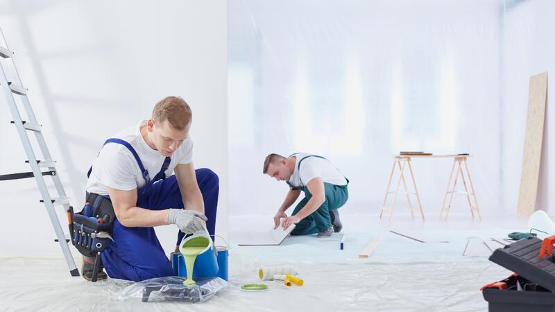
Preparation and Prime
Quality interior paint projects begin with proper preparation. This includes cleaning walls, repairing damage, filling holes, and applying primer where necessary. Many trendy colors, particularly deeper jewel tones and bold hues, require a quality primer to achieve optimal color saturation and coverage. KC Painting includes thorough preparation in all our projects, ensuring a flawless finish that showcases your chosen color.
Paint Quality and Coverage
Not all interior paints are created equal. Quality paints offer better coverage, more durable finishes, and superior color accuracy. While budget paints might seem cost-effective initially, they often require additional coats and don't perform as well over time. Most quality interior paints range from $35-$70 per gallon, with specialty finishes or designer colors running higher.
Application Technique
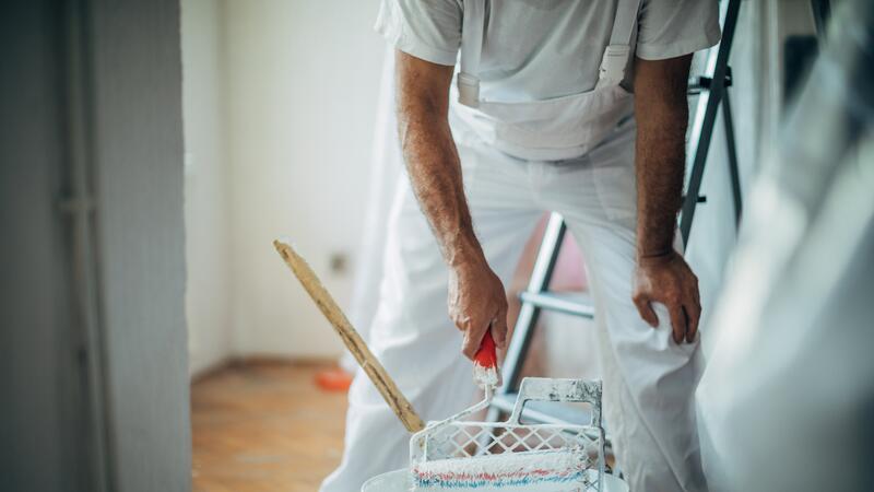
The way paint is applied significantly affects the final result. Proper cutting-in, rolling technique, and allowing adequate drying time between coats ensures an even, professional-looking finish. This is where hiring a professional painter becomes invaluable, particularly when working with bold or trendy colors that demand precision and expertise.
Frequently Asked Questions
What are the most popular paint colors for 2024-2026?
The most popular interior paint colors trending right now include warm neutrals like greige and accessible beige, rich jewel tones such as deep navy and emerald green, calming colors like sage green and soft blue, and warm earthy tones including terracotta and golden yellow. Each of these color categories offers multiple options to suit different preferences and room applications.
How do I know if a trendy color is right for my home?
The best way to determine if a trendy color works for your space is to test it thoroughly in your home's actual lighting conditions. Purchase sample pints, paint large swatches on your walls, and observe them throughout the day over several days. Consider how the color makes you feel, how it coordinates with existing elements, and whether you envision living with it happily for years to come. KC Painting can also provide professional recommendations based on your space's characteristics.
Are jewel tones too bold for most homes?
Jewel tones are far more versatile than many people assume. When used thoughtfully—whether as accent walls, in smaller spaces, or in rooms with ample natural light—jewel tones create sophisticated, beautiful spaces. The key is proper execution and choosing colors that align with your personal aesthetic. KC Painting specializes in helping Kansas City homeowners successfully incorporate bold colors into their designs.
How much does it cost to paint a room with a trendy color?
The cost of painting a room depends on the room's size, ceiling height, existing wall condition, and whether primer is needed. Generally, expect to pay between $500-$2,000 for professional interior painting in Kansas City. Trendy colors, particularly deeper jewel tones, might require additional primer coats, slightly increasing costs. For an accurate estimate, contact KC Painting at (816) 281-7039 for a consultation.
What neutral paint colors will never go out of style?
Timeless neutral colors include warm beiges, soft taupes, creamy whites, and greige. These versatile hues work with virtually any design style and coordinate beautifully with changing décor. Warm greige and accessible beige are particularly enduring, as they offer sophistication without the coldness of pure gray or the stark appearance of bright white.
Can I use trending colors in a rental property?
While trending colors can make spaces more appealing and potentially increase perceived value, many landlords prefer neutral tones for rental properties to appeal to broader audiences. However, softer trendy colors like sage green or pale blue could work well, while bolder jewel tones might be better reserved for owner-occupied properties or used in accent fashion that's easier to modify.
How do I transition between rooms with different trending paint colors?
Thoughtful color transitions between rooms create visual flow and prevent your home from feeling disconnected. Use coordinating colors from the same family (different shades of blue, for example), or select colors that share similar undertones. Neutral transition spaces, like hallways or entryways, can bridge bolder colors in different rooms. KC Painting can help you plan a cohesive whole-home color scheme that flows beautifully throughout your Kansas City home.
Transform Your Kansas City Home with Trending Paint Colors
The interior paint colors trending this year offer something for every taste and style. Whether you're drawn to calming greens and blues, sophisticated jewel tones, warm earthy hues, or timeless neutrals, there's a perfect color waiting to transform your Kansas City home. The key is selecting colors that resonate with you personally while considering your space's unique lighting, existing elements, and functional purpose.
At KC Painting, we're passionate about helping Kansas City homeowners bring their interior design visions to life. Our experienced team understands current paint color trends and, more importantly, how to apply them to create beautiful, lasting results. We've spent years working with homeowners throughout Kansas City, MO, and we know what works in our regional climate and lighting conditions.
If you're ready to refresh your home's interior with trending paint colors, we'd love to help. Our team can guide you through color selection, discuss options that work best for your specific spaces, and deliver professional, high-quality painting that brings your vision to life.
Ready to transform your Kansas City home with trending paint colors? Contact KC Painting today for a free consultation and estimate. Call us at (816) 281-7039 to discuss your project with our experienced team. Let's create the beautiful, stylish interior you've been envisioning!